28.9.13

Clothing for Real People

The wonder of advertising.

Here a sign for "casual clothing for real people".  What sort of other people are there?  There's imaginary I suppose, and I expect some people or their behaviour may well be might be described as "unreal", so remarkable as to elicit disbelief.  Maybe the real sign is itself unreal in it's implication ....Hmmmm.....


21.9.13

Value the hand drying experience

Here's the hand dryer in a garden centre loo....

However while the hand dryer exists in the singular here, there is one of them, it's described in the plural.  It's quite possible that someone was asked to "make some signs for the hand dryers" with them being in different places - at least the ladies and the gents - and maybe because to some it might  not look much like a dryer at first glance.

Another alternative is that the radiator could be considered a dryer convecting heat upwards while the hand dryer projects heat downwards.  Maybe that's why there's such an explicit encouragement to "Value the Experience".


14.9.13

Really Ram Raid Resistant

An the wall of a now defunct out of town electrical retailer.

As well as ram raid bars, there's no less than four additional defensive mechanisms.....the wall is reinforced, ram raid resistant, alarmed and under 24 hour CCTV surveillance.  The irony the real risk to the company were commercial ones... apparently slower than the rest to shift this physical emphasis of effort into web sales.....


Welcome - risk of death

This is a welcome sign on approach to the delightful Alnwick Garden in Northumbria.  The garden has lots of attractions and features - the grand cascade waterfall which is it's signature feature, a giant treehouse with walkways and restaurant, the walled rose garden and so on.  But rather than those,  the feature being promoted on it's welcome board is the poison garden, a real feature in it's on right of course, but perhaps not making the warmest of welcomes.


7.9.13

Push the Pull Door

Here it seems like someone has a acquired job lot of pull/grab handles and fitted them to both sides of the door. So pull handles on the pull side and pull handles on the push side.  So rather than the typical push plates on the push side (often with the word "Push" etched in for good measure) here you're approaching a door with the familiar grab handles which are crying out to be pulled.  Hence the need for the retro fit instruction on how to operate the door... "Push".


31.8.13

Bank Holiday Opening Closing

From the local Library...

Another great example of over use of positive language.  There's a bank holiday and the library is closed, and so it's Bank Holiday Closing.  There's no Bank Holiday Opening at all.


24.8.13

Footpath Closed Closed

This is one of those signs that does rather require a bit of mental maths.  The start date is fine, although often self evident that works have started.  It's the way of expressing the finish which always seems to be the odd thing.  In giving a start date, and a specific finish point then surely it's better to express the finish point as a date too.  

It's the "four weeks" that seems like unnecessary mental maths.  This is easy enough in this case, but what about longer periods when they straddle months....that can trigger the "how many days in the month" calculation (30 days hath September, April... etc)  

That ever more curious as the two things to know here are (a) it's closed and (b) when it will open again. 


This is a local footpath across the common and a popular pedestrian route to and from the train station.  While it's a proper upgrade, to simply shut it is a real inconvience, and especially so as it seemed to be take so long to do the work.  And with the footpath looking a fine as this so much of the time to commuters, it seemed that lots of people were simply continuing to use it....hence the need for a second sign and lots of creative but rather ineffective fence making....


Concerns Complaints Queries

One of those places that is keen to show it cares about it's loos.

Its more typical to see a table with cleaning times (although watch out for those that are simply a table of inspection times, which do not mean things are necessarily cleaned).

Here the emphasis is on the checking rather than the cleaning, but of interest here is the mixture of concerns, complaints and queries.  So if you have a concern take them to reception, but it's only complaints and queries which they offer to resolve in a timely manner.  A concern might be neither a complaint or in deed a query....I might be concerned that the floor is a bit wet and slippy and a potential risk which I want to point out, without it being a complaint or have a query about it.


17.8.13

Exclusively Exclusive Excusivity

Exclusive is one of those special words....

The 'only' thing that make these flats exclusive is having the money to buy one.  Surely that logic applies to any commercial product, and hence by that same rationale how about some "exclusive washing up liquid", an "exclusive toothbrush", or even that "exclusive banana". 


10.8.13

Really Real Risk

Risk is an ever popular term. In the workplace we see risk strategies, risk assessments, risk registers and the like.  Often written from the comfort and safety of an air conditioned office about financial, reputational or even opportunity risk.

Here's a sign about risk....

Risk of Injury, Do Not Cross Barrier

The sign itself is looking a bit aged unloved, as are the surroundings. Perhaps the sign's not really needed and has been forgot about, and may be not relevant anymore.


But pan back and stand around a little and the very real risk becomes very clear indeed


Reassuringly there's a more serious sign along the way....does make you wonder if the original rather tired sign is actually doing more harm than good.


Closed for Coffee

This sign was seen on approach to the servery in the library cafe....


However approaching closer, the there are more of these signs, interspersed among an abundance of food offerings......and especially the real teaser of a sign, situated right above the bacon.....

But the specific scope is missing... Tea and filter coffee are the only hot drinks being served, rather than the only things being served.


Great that there's a why explanation here "mechanical failure" which would appear to the the machine that makes all the modern variety of coffees.

3.8.13

X-Ray Red-Herring

Here's the waiting area for X-Ray in hospital.  X-rays are not good for you generally, so a great idea to warn people off, and so avoid any unnecessary exposure.

The sign...."X-RAYS Do not enter when the light is on".  So have a look around for that light.  Hmmm....

Is it that black box above the door? It looks like a light with the a black lens.  Or that sign to the right which is definitely backlit and the light "Controlled Areas" is definitely on.

Well it's neither.....they are both red herrings.  The "Light is on" sign is referring to is a red lit "Do Not Enter" sign under the "Controlled Area" lit sign.

Seems poor signage to help preserve good health.

27.7.13

Hospital Hush

This is from Dartmouth.   So "Hospital Quiet Please" is top of the pile of signs, and at the bottom of the pile "All HGV's".  That sure is a contradiction and a half.


20.7.13

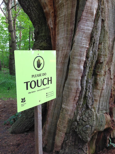
Attention Do Touch

That's "Attention Do Touch", rather than "Attention Do Not Touch".  It's so easy to read in that not to that sentence given the number of times we see the do not touch message.

So hats off to the National Trust for these signs in a rather remote woodland walk at Ickworth Park in Suffolk.

NOTICE the beautiful wild flowers as you walk through the woods. Take pictures, smell them and enjoy your day.

ATTENTION You will need this to spot the abundance of wildlife in this area.

PLEASE DO TOUCH. the trees or even hug them.

Great the way those words like notice, attention, which are more often seen in a forbidding context are turned on their head here. Those headline words play to that forbidding sense to attract you, and then the twist dawns as you read on.  Then there's the positive encouragement to do things like photograph and touch, again words were more used to seeing in a dissuasive content.

Just fantastic.


Gas Gap Parking

So a no parking sign with a difference - a reason.  The power of why, if only implied.

Looks like the mini graffiti version might not have been so effective.  But it'a big brother seems to be doing the job.  

So there's a polite "Please", though a bit shouty in capitals, with some apparent teeth "by order" and in police blue, plus it's quite specific.  There's the implied why around access to gas meters, but also potentially some risk to them from parking up the kerb or entry/access to the vehicle.  There's probably some other implied incentive here around not wanting to park over a gas supply.....


13.7.13

Naughty Newspaper

So much does the Daily Express cost today?


Well 50p of course.  Hmmmm... that makes it 10p cheaper than the Daily Mail.  A classic switch of dimensions....the absolute cost (50p) with the relative cost (10p less than the Mail).  And that's relative to a competitor's newspaper, but why stop there.....at 50p that's £254,999.50p cheaper than an average house.


Source: Office for National Statistics House Price Index July 2013
Average mix-adjusted house prices in July 2013 stood at £255,000 in England.

6.7.13

Confidentiality Crisis

On leaving hospital as a visitor, this sign was adjacent to the door and targeted at staff... an Information Security Warning.

"Staff must not take patient or staff data out of the building unless:
- Authroised to do so
- It is carries in a zipped/locked bag or
- It is electronically tagged".


On closer inspection of the three bullet points it can raise some questions...whether all or only some of the three apply.  

1. "Authorised to do so" - that's clear enough and seems mandatory to comply.

2. "It is carried in a zipped/locked bag or" - it would appear that zipped/locked are alternatives which implies zipped or locked.  And there's now an explicit  "or" which relates the the third bullet point....

3. "It is electronically encrypted" - in which case it need not be in a zipped or locked bag.

So it would appear that bullet one would need to apply, but then only one of the second or third bullets points.  In reality the third bullet is really part of the second.  So the first bullet is about permission and the second about the mechanism....should only be two bullets really.

So we've checked....We have some papers in a zipped bag.  Phew.

Now having felt reassured that we are compliant we head for the car park where we find a very similar but subtly different Information Security Warning...


At this point the requirements are different....now it has to be a locked rather than permitting a zipped bag.....Oh dear, we've become non-complaint as we've walked across the car park.


Dirty Directions

Some rather dirty road signs. It does seem rather odd how road signs can be left to become so dirty. And especially those welcoming and twinning ones, naming the town you're entering often maybe with a flower bed too. That flower logic does try to create a positive sense, in the the spirit of "You don't get a second chance to make a first impression".  So it is surprising how many naming or welcoming signs can become so scruffy and unloved.  Here's a fascinating example of some road directions.  The Huntingdon one has been cleaned by not the others....Keeping signs clean is not such a big overhead...it's typically a simple and quick process. The real convincer in all of this is that drivers need to be and will be reading signs and so the number of views of passing motorists can be tremendous....that's lots of impressions left.


29.6.13

Footpath Definitely Closed

This is outside a London Mainline Station.  As if the words "Footpath Closed" plus the graphic were not enough, that is also re-worded presented as "Do Not Processed Beyond this point".  Plus some barriers for good measure.  That makes it four good clues.  But being London, someone will be tempted to shimmy along the kerb.....


22.6.13

Burger Sauce... Great with....

....burgers of course.... according the the label....A fantastic statement of the obvious.  It's that marketing need to always include a "serving suggestion" to help sell the experience rather than the product....and that's policy forever no matter what...


15.6.13

Oi! Fibre broadband is here!

Painting this local telcoms box green must have been to help make it more subtle and blend into the local environment. An then someone slicks a very unsubtle rainbow effect on, which rather defeats the whole point.


8.6.13

No Entry - Well Maybe

A bold no-entry sign on some doors to a hospital corridor - it's actually the one that leads from the main hospital reception through to Accident and Emergency.

Looks clear enough - and on both of the double doors too.

But then there's the message...

It's about using the doors only at certain times....Not between midnight and 7am, unless directed to do so.....

So this sign applies at night time only, and for some people only.

And then there's some handwritten additions.....it would appear not to apply to patients but visitors are ok.

So this all gets a bit complex for sure...

So this sign is not applicable for daytime, so it's the timing messages that should really take precedence over the no entry message.

The upshot is...

...Visitors are ok to pass through any time of day or night

... Patients can go though during the day, but not at night unless directed.

...In short...it's no entry to undirected patients at night.


There's a question about relevance here.  This sign is directed at a small number of people, compared to those who see it and rule it out as not being applicable to them...which is at least all daytime patients and visitors.....


1.6.13

Automatic Door - Push to Open

Wonderful contradictory messages from the local hospital.

As you approach the door you helpfully see the "Automatic" door message facing you as you approach the door.  It's all glass, no handles, and a reassuring sensor at the top.  No problems....


Ah, then there's the button to the side to open the automatic door.....


25.5.13

Road Closed Until....Errrrm

One of those partially closed road signs.

Another example of the mental maths here to calculate 4 weeks from 18th May....and typically while driving. Maybe working out things like what day is/was 18th and how many days in May to calculate 4 weeks.....

Easier and clearer to simply have the finish date....


18.5.13

Good Luck Gate

Now this is where a sign is missing. A gate for a path at a National Trust Park.

It's fantastic design, which allows the gate to open in either direction.  It's also a lovely piece of engineering. and quite different to the usual gate catches.  But looking at it it's really difficult to see how it operates, not made any easier by the fact that it was fitted a little low.  It turns out it's easy to get fingers caught too.  So a sign with two messages please, how to operate and how to avoid getting fingers caught.


Do not.....ouch

Here's some tempting looking hot pasties...plenty of reasons to have a closer look....check what they are, how they look and how much....fingers crossed we can make out the rather ineffective "Hot do not touch" sign in time....Maybe it's the unintended consequences of the paste tax....below a certain temperate relative to room temperature, so no longer officially "hot".


11.5.13

Permitted Perambulators

A lovely old sign from a passage way in the Norfolk Coastal town of Sherringham.  Would have been a serious sign for it's time.  Perambulator is a predecessor term for pram, and they sure were bigger in those days.


Only 3 Mind Reading Children

A message seen from time to time....Only 3 school children at once.

It's really a statement of internal policy.

As a child on the outside thinking of going in, how would you know how many children were inside to know whether you could go in an be under the limit or potentially chastised for being that 4th child....

This "only" also points to three being the only number, not two or one.

And how would you know if they were school children or not? Maybe the implication here is school uniform. But then what about those older ones 17 with beards, casually dressed, still a child still at school......


4.5.13

Loo Logic

Here's a not uncommon sign to be found in the cafe loo....

Please only put toilet tissue down the toilet.  Really? The only thing is toilet tissue!  What about the human waste?  May be it's just obvious that there are implicit exceptions to this.  Otherwise this sign fails in it's direction each time the loo is used of course.

That "only" word does get mis-used, often due to confusion about scope.  In some places this has evolved to be more specific....about not putting nappies and sanitary products going down there.


20.4.13

Too fragile to touch

In National Trust and English Heritage properties, it's usual to see quite polite notices to dissuade some activities.   Even simply suggestive rather than specific signage....so for example the bunched lavender sprigs place on antique chairs to discourage sitting down.  Then there were these "Too fragile to touch" signs.  The polite way to discourage handling, and with a clear purpose too.

Now this next "Too fragile to touch" notice seems to have been touched so much, that it might also have become too fragile to touch itself....And as if that was not itself curious, it even looks in worse condition than that to which it relates....


Please be Seated

Why use one sign when 10 will do.

Here's a waiting area at the local hospital, specifically the waiting area for Assessment in the Accident and Emergency Department.

"Assessment Waiting Area.  Please take a seat further back in the waiting room once you have seen the assessment nurse"

A nicely defined area here where a couple of wall signs might have done the job.  However here every seat gets it's very on sign.

What's curious is that when all the seats are occupied none of the signs can be seen of course....


13.4.13

Beware the.....

Caution....Barber Ware? 

Maybe we need a Caution Stinging Nettles Sign as you approach to read the obscured Caution Barbed Wire Sign.