20.7.13

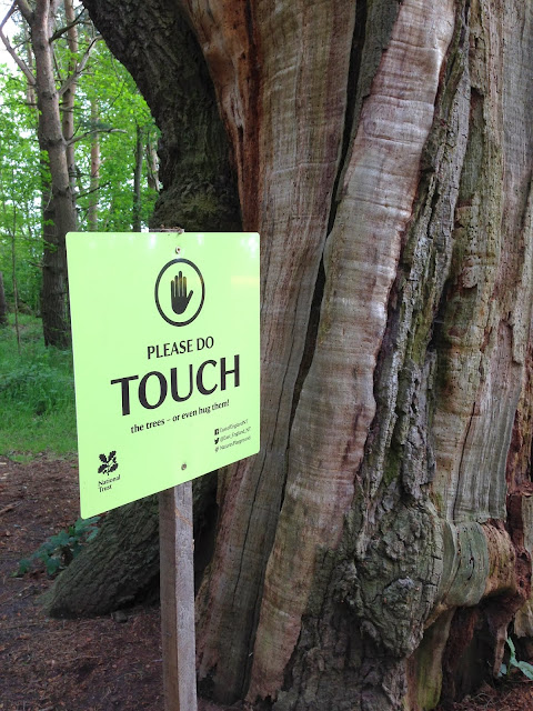
Attention Do Touch

That's "Attention Do Touch", rather than "Attention Do Not Touch".  It's so easy to read in that not to that sentence given the number of times we see the do not touch message.

So hats off to the National Trust for these signs in a rather remote woodland walk at Ickworth Park in Suffolk.

NOTICE the beautiful wild flowers as you walk through the woods. Take pictures, smell them and enjoy your day.

ATTENTION You will need this to spot the abundance of wildlife in this area.

PLEASE DO TOUCH. the trees or even hug them.

Great the way those words like notice, attention, which are more often seen in a forbidding context are turned on their head here. Those headline words play to that forbidding sense to attract you, and then the twist dawns as you read on.  Then there's the positive encouragement to do things like photograph and touch, again words were more used to seeing in a dissuasive content.

Just fantastic.


Gas Gap Parking

So a no parking sign with a difference - a reason.  The power of why, if only implied.

Looks like the mini graffiti version might not have been so effective.  But it'a big brother seems to be doing the job.  

So there's a polite "Please", though a bit shouty in capitals, with some apparent teeth "by order" and in police blue, plus it's quite specific.  There's the implied why around access to gas meters, but also potentially some risk to them from parking up the kerb or entry/access to the vehicle.  There's probably some other implied incentive here around not wanting to park over a gas supply.....


13.7.13

Naughty Newspaper

So much does the Daily Express cost today?


Well 50p of course.  Hmmmm... that makes it 10p cheaper than the Daily Mail.  A classic switch of dimensions....the absolute cost (50p) with the relative cost (10p less than the Mail).  And that's relative to a competitor's newspaper, but why stop there.....at 50p that's £254,999.50p cheaper than an average house.


Source: Office for National Statistics House Price Index July 2013
Average mix-adjusted house prices in July 2013 stood at £255,000 in England.

6.7.13

Confidentiality Crisis

On leaving hospital as a visitor, this sign was adjacent to the door and targeted at staff... an Information Security Warning.

"Staff must not take patient or staff data out of the building unless:
- Authroised to do so
- It is carries in a zipped/locked bag or
- It is electronically tagged".


On closer inspection of the three bullet points it can raise some questions...whether all or only some of the three apply.  

1. "Authorised to do so" - that's clear enough and seems mandatory to comply.

2. "It is carried in a zipped/locked bag or" - it would appear that zipped/locked are alternatives which implies zipped or locked.  And there's now an explicit  "or" which relates the the third bullet point....

3. "It is electronically encrypted" - in which case it need not be in a zipped or locked bag.

So it would appear that bullet one would need to apply, but then only one of the second or third bullets points.  In reality the third bullet is really part of the second.  So the first bullet is about permission and the second about the mechanism....should only be two bullets really.

So we've checked....We have some papers in a zipped bag.  Phew.

Now having felt reassured that we are compliant we head for the car park where we find a very similar but subtly different Information Security Warning...


At this point the requirements are different....now it has to be a locked rather than permitting a zipped bag.....Oh dear, we've become non-complaint as we've walked across the car park.


Dirty Directions

Some rather dirty road signs. It does seem rather odd how road signs can be left to become so dirty. And especially those welcoming and twinning ones, naming the town you're entering often maybe with a flower bed too. That flower logic does try to create a positive sense, in the the spirit of "You don't get a second chance to make a first impression".  So it is surprising how many naming or welcoming signs can become so scruffy and unloved.  Here's a fascinating example of some road directions.  The Huntingdon one has been cleaned by not the others....Keeping signs clean is not such a big overhead...it's typically a simple and quick process. The real convincer in all of this is that drivers need to be and will be reading signs and so the number of views of passing motorists can be tremendous....that's lots of impressions left.


29.6.13

Footpath Definitely Closed

This is outside a London Mainline Station.  As if the words "Footpath Closed" plus the graphic were not enough, that is also re-worded presented as "Do Not Processed Beyond this point".  Plus some barriers for good measure.  That makes it four good clues.  But being London, someone will be tempted to shimmy along the kerb.....


22.6.13

Burger Sauce... Great with....

....burgers of course.... according the the label....A fantastic statement of the obvious.  It's that marketing need to always include a "serving suggestion" to help sell the experience rather than the product....and that's policy forever no matter what...


15.6.13

Oi! Fibre broadband is here!

Painting this local telcoms box green must have been to help make it more subtle and blend into the local environment. An then someone slicks a very unsubtle rainbow effect on, which rather defeats the whole point.


8.6.13

No Entry - Well Maybe

A bold no-entry sign on some doors to a hospital corridor - it's actually the one that leads from the main hospital reception through to Accident and Emergency.

Looks clear enough - and on both of the double doors too.

But then there's the message...

It's about using the doors only at certain times....Not between midnight and 7am, unless directed to do so.....

So this sign applies at night time only, and for some people only.

And then there's some handwritten additions.....it would appear not to apply to patients but visitors are ok.

So this all gets a bit complex for sure...

So this sign is not applicable for daytime, so it's the timing messages that should really take precedence over the no entry message.

The upshot is...

...Visitors are ok to pass through any time of day or night

... Patients can go though during the day, but not at night unless directed.

...In short...it's no entry to undirected patients at night.


There's a question about relevance here.  This sign is directed at a small number of people, compared to those who see it and rule it out as not being applicable to them...which is at least all daytime patients and visitors.....


1.6.13

Automatic Door - Push to Open

Wonderful contradictory messages from the local hospital.

As you approach the door you helpfully see the "Automatic" door message facing you as you approach the door.  It's all glass, no handles, and a reassuring sensor at the top.  No problems....


Ah, then there's the button to the side to open the automatic door.....


25.5.13

Road Closed Until....Errrrm

One of those partially closed road signs.

Another example of the mental maths here to calculate 4 weeks from 18th May....and typically while driving. Maybe working out things like what day is/was 18th and how many days in May to calculate 4 weeks.....

Easier and clearer to simply have the finish date....


18.5.13

Good Luck Gate

Now this is where a sign is missing. A gate for a path at a National Trust Park.

It's fantastic design, which allows the gate to open in either direction.  It's also a lovely piece of engineering. and quite different to the usual gate catches.  But looking at it it's really difficult to see how it operates, not made any easier by the fact that it was fitted a little low.  It turns out it's easy to get fingers caught too.  So a sign with two messages please, how to operate and how to avoid getting fingers caught.


Do not.....ouch

Here's some tempting looking hot pasties...plenty of reasons to have a closer look....check what they are, how they look and how much....fingers crossed we can make out the rather ineffective "Hot do not touch" sign in time....Maybe it's the unintended consequences of the paste tax....below a certain temperate relative to room temperature, so no longer officially "hot".


11.5.13

Permitted Perambulators

A lovely old sign from a passage way in the Norfolk Coastal town of Sherringham.  Would have been a serious sign for it's time.  Perambulator is a predecessor term for pram, and they sure were bigger in those days.


Only 3 Mind Reading Children

A message seen from time to time....Only 3 school children at once.

It's really a statement of internal policy.

As a child on the outside thinking of going in, how would you know how many children were inside to know whether you could go in an be under the limit or potentially chastised for being that 4th child....

This "only" also points to three being the only number, not two or one.

And how would you know if they were school children or not? Maybe the implication here is school uniform. But then what about those older ones 17 with beards, casually dressed, still a child still at school......


4.5.13

Loo Logic

Here's a not uncommon sign to be found in the cafe loo....

Please only put toilet tissue down the toilet.  Really? The only thing is toilet tissue!  What about the human waste?  May be it's just obvious that there are implicit exceptions to this.  Otherwise this sign fails in it's direction each time the loo is used of course.

That "only" word does get mis-used, often due to confusion about scope.  In some places this has evolved to be more specific....about not putting nappies and sanitary products going down there.


20.4.13

Too fragile to touch

In National Trust and English Heritage properties, it's usual to see quite polite notices to dissuade some activities.   Even simply suggestive rather than specific signage....so for example the bunched lavender sprigs place on antique chairs to discourage sitting down.  Then there were these "Too fragile to touch" signs.  The polite way to discourage handling, and with a clear purpose too.

Now this next "Too fragile to touch" notice seems to have been touched so much, that it might also have become too fragile to touch itself....And as if that was not itself curious, it even looks in worse condition than that to which it relates....


Please be Seated

Why use one sign when 10 will do.

Here's a waiting area at the local hospital, specifically the waiting area for Assessment in the Accident and Emergency Department.

"Assessment Waiting Area.  Please take a seat further back in the waiting room once you have seen the assessment nurse"

A nicely defined area here where a couple of wall signs might have done the job.  However here every seat gets it's very on sign.

What's curious is that when all the seats are occupied none of the signs can be seen of course....


13.4.13

Beware the.....

Caution....Barber Ware? 

Maybe we need a Caution Stinging Nettles Sign as you approach to read the obscured Caution Barbed Wire Sign.


6.4.13

Office - Caution Compressed Air


Here a couple of neighbouring signs on a door in the local hospital.

"Office"
"Caution Compressed Air"

It's the neighbouring nature of these signs which do rather hint at an association....

23.3.13

Best Worst Sandwich

So this sandwich is  "The best sandwich I've ever had" A quote from somebody called John Thorpe.  

Maybe giving this some personal reference gives it some convincing credibility.  Just because it's been said does not make it true.  Even if we assume John is sure and true, the credibility of the quote depends rather more on how many sandwiches our dear friend John has had.

Of course if this was the first sandwich that John ever had - it would still be the best - but it would also be the worst of course...


Blue Badge Beration Behaviour

Here's a parking notice for blue badge holders at a local authority car park.

Blue badge holders also have a blue card clock that sometimes needs to be displayed alongside the blue badge where blue bad parking has some time limit.  Simple enough... set the cardboard hands on the cardboard clock to the parking arrival time.

This sign goes a step further.  Rather than simply - as would be usual - ask for the clock to be displayed, ...here there's a rather different exacting tone here....that they "must be displayed correctly".  That's all rather implicit in their use, and explicit in the instructions that come with the Blue badge.


16.3.13

Disguised Directions


Here's a road sign...

It's a T-Junction, approaching from the trunk of the T.  So the left and right direction arrows are meant for us.

However the support for the other signs obscures our sign.

It's always amazing that with the degree of concentration that desired and needed on the roads, and especially so at junctions, that extra barriers like this are created.


9.3.13

Water Cooler Confusion

Here's a water cooler dispenser.

Two outputs for water - left and right.  One for cooler water than than the other.

Two buttons to press - top and bottom.

The assumptive link here is that we tend to work left to right and top to bottom, so logically the top button produces water from the left side.  But we do need to explicitly think about this and check ourselves.  Maybe that's why there's a wet floor as people do get it wrong, and enter health and safety considerations and hence the sign.  Water's no only a precious resource but costs money too, so no real excuse to be less than really clear. Wonder how many people get cold when they want regular and then vise vera and end up wasting.

Why not just put the buttons side by side, even some labels might help.


2.3.13

Left Right Litter

So litter bins. And two of them too.  But there's a difference....One had a white backed litter sign and one has a red backed litter sign.  So what does that mean for litter.  We're all becoming increasingly familiar with the need to separate recycling from our rubbish and even separating out our recycling into different sorts.  But separating out litter into different sorts.

And red too makes us stop and think - as it's a serious warning colour... Red traffic lights (and even red blood) which makes us think even harder about if and what is the difference in purpose of these two bins.

An then....with the red theme....is that red signed bin anything to do with the red-banded bin to the side?


23.2.13

Push the floor

What do you do when you find a sign on the floor that says push.  Well this one seems to have fallen from a a double door.  The reason a push sign was necessary in the first place as a retro fit, was that those double doors had grab handles that positively encouraged pulling....


Strictly No Exit

As if the words "No Exit" were not clear and explicit enough, here it's "Strictly" no exit.  That does rather imply that a "No Exit" sign really just means "It's OK to exit sometimes".

16.2.13

Sit down and put your feet up?

From a train.  This two pairs of seats opposite each other with the table in between....


The picture of the sign might seem to be encouraging the whole...sit down and put your feet up...while the words of course are discouraging that.  Culturally we probably get this "no feet on seats thing" anyway.  

It's often more typical to show the action that is being discouraged and put it in it's own frame and put a line through it....no smoking for example....cigarette in a red circle with a thick red line across.

Nice that's it's positive language with a request to do do something...."keep feet of seats" rather than the more negative "Please do not put feet on the seats".  More naturally to think the positive action than the negative action and reverse it....


9.2.13

Emergency Exit Exclusion

Here's some sign jumble at the local hospital.  This is coded the entry/exit for ambulance crew to directly access the Accident and Emergency Department.

So the "Ambulance Staff Only" sign is properly obscured by the emergency exit sign.  It might just raise the question if it's the emergency exit for Ambulance staff only....And with Red signage, that seriously instructive colour of red traffic lights.

An then there's the ordering of the signs.  So first it's emergency exit, and then it's Ambulance staff only....and signs or instructions then to follow on logically from the previous ones....so emergency exit but exclusively for ambulance staff.

In reality the emergency exit sign will do it's job in all probability.....Can't help but wonder if that lack of clarity in managing the messaging - especially important ones like emergency exit -  inspires enough confidence when it comes to actually managing an emergency.....


2.2.13

Norovirus Notice

Here's a printed page stuck to the entrance doors of the local hospital.

The sign is rather scruffy and it's dated nearly a year ago.  So how much credence will it get?

Wonder how much is the credibility reduced by it's slightly dog eared nature and it's rather historical date stamp.  Does this relate to last winter, that's been and gone, as has the subsequent spring and summer....

Given these viruses can have serious health consequences, and this is the main communication with visitors on the matter, whether this needs to have more presentation and temporal credibility....


26.1.13

Trained Person Only

Some standard 13Amp sockets... The same as that used in homes by adults, even children, up and down the county day after day, but this one is to be used by a "Trained Person Only".....


20.1.13

Royal Reservation

On a winter visit to the Queen's Sandringham Estate in Norfolk we called in to the visitor centre for a family Sunday lunch.

Much to our amusement the neighbouring table had been reserved for King. In our waterproofs and wellies we suddenly felt a tad under dressed.....


13.1.13

Bangers and Mash Up

Here’s the poster from my local Sainsburys.


It's what I shall call a “calco”, a mis-calculation, the numerical equivalent of “typo.”

Now £3.79. Was £4.29. Save 70p.

Actually that should be save 50p.

Or should it? All we can tell is that these numbers are not consistent with each other, and so any one could be wrong. Interestingly there’s no way of knowing on the face of it which of the numbers is wrong…might just need to buy some sausages and mash to find out.

But all is not lost. If we want to assume that only one of the three numbers is wrong, then by means of mathematical deduction, we can go as far to say that we would save 50p or 70p.

The fact that this error found its way on to the shop floor of a national chain is no mean feat. The poster will have been through some design, create, print, and probably approval process. Then distributed to stores and then shop floor and no one noticed this simplest of errors. Especially when you consider that the primary objective of the poster would appear to be to make a specifically numerical point.

Also makes me think that perhaps we need a “maths-checker”, the numerical equivalent to a spell checker. It would identify the numbers in prose and check for some sort of mathematical relationship.

12.1.13

Library Liability

Since 1997 the British Library has been based at these premises, next to St. Pancras Station in London.  Holding over 150 million items held for posterity and research, and with a full programme of exhibitions, the design of the building courted significant controversy - it's really polarises opinion.  I should know I worked there....


That design has bring unique foibles necessitating some unique signage.   Here are the steps leading up to the front entrance.  It's been necessary have a sign for each of the steps.  Given the regular exhibitions here, this might just qualify as an installation.....


5.1.13

Please Please Be Good

Please please be good, you know that you should.  So many signs are implicitly negative rather than positive.  That’s often due to the desire to discourage specific activity.  It can be more positive and  engaging to instead encourage the desired activity.   So please be good rather than don’t be bad.

A lovely example here of a positive request basically “Please keep on the paths”,  rather than the so much more common negative request to “Please keep off the grass”.

That has a deeper impact than we might first think.  We have inbuilt trouble with thinking the reverse.   A good example is "do not think of a blue duck".  You can't help but envisage the duck.  By the same logic negative instructions start the thinking about the negative situation rather than the positive.


Welcome

Welcome

This is a home for all those wonderfully odd  instructional, guidance and informational signs that we see about....especially where they are curious or confusing.

I remain amazed at how many of these signs that I've come across, often not fully fit for purpose in some way which creates the opportunity for unnecessary confusion.  That simply makes people think more than they need to, and especially when that thinking is an extra barrier of time and effort to some call to action.

Some make us smile, even laugh, and other can be downright curious and odd, and sometimes even a tad annoying or frustrating.  It's also great to find good ones, so there's some of those too.

So....Sign + Sense + Ability.... something about the ability to make signs make most sense.....

Enjoy.

Paul

Paul Askew

paul.askew@signsenseability.org.uk