26.7.14

Respectful Recycling

Some simple please and thank yous can really help set positive, polite and engaging tone.  Here for some recycling bins.  A less formal font for the please and thanks yous too.


20.7.14

Solo Motorcycles Only

Some dedicated London parking for 'solo motorcycles only'.

Given that the alternative to a solo motorcycle is a motorcycle with a sidecar,  and motorcycles with sidecars are so rare, then the word solo is rather overprescriptive, even superfluous.  

Also, most solo motorcycles can carry a pillion passenger.  Technically that would make them no longer solo.  So motorcyclist and passenger, just as with a sidecar.


19.7.14

Properly Private Property

Some lovely old and substantive 'Private Property' signs adorning the edge if a public footpath across a meadow.  Super three dimensional signs cast in metal, and have stood the test of time.


13.7.14

Please Sweep up

At the local recycling centre... "Please sweep up. Thank you'.

So please and thank you, so as many polite words as instruction words.

What is nice about this is that the implication is that you sweep up your own mess. But if course this could be read as a direct instruction to sweep up mess, irrespective of whether it's your own or not.  Even if you don't have any rubbish...coming across this sign seems to ask you to muck in.

12.7.14

Cupboard Door Exit

A fantastic large old house converted to a tea room.  With some alterations to provide all the necessary facilities of course.

From inside the toilet the thing that looks like the exit door - delightful and substantive four panel - is not exit/entrance door but in fact the cupboard.  There's a wonderful sign near the handle saying as much....'This us a cupboard not the way out'.  The actual exit is a more plain affair, flat with a run handle and grab rail.   So the visual clues are less.... with the cupboard there are fur panels and and handle to naturally draw you.

To help, as well as the negative "don't use this door message", how about a positive "This is the exit sign" on the real exit door.


6.7.14

Door Challenge

A sturdy oak door to the farm shop tea room.

So there's a clear polite sign... 'Please close the door behind you'.  Tis lrft at's reasonable enough as it's winter and its chilly.  However, as it's winter the door has swollen and is very difficult to pull properly closed.

That sign now takes on a very different messsge.  The owner/staff will know the door is stiff but still the sign is there.  So now the sign means that you're being expected to win the battle with the very stiff door.  Be prepared to use all your might and make some noise. 

Now that reasonable, clear and polite sign now seems like a much less reasonable customer test.  In reality, the door Is left jammed against it's frame but not fully closed.

Right, off to the farm shop now, curious about what other unreasonable customer requests are yet to come.


5.7.14

Sorry Warden

Not in use sign on a loo door at a camp site...."Not in use until further notice Sorry for any inconvenience Warden"

So the first couple of lines seem like a whole sentence.  "Not in use until further notice" with the slightly bigger "Not in Use" to emphasise the point up front.  

Then what you might think was a second sentence...'Sorry for the inconvenience warden'. So an apology to the ward.   It's really a second sentence with an authorship statement underneath...which makes it an apology from the warden.   The second sentence idea sense is reinforced by the fact it's longer and hence scrolled onto the next line. 

In this case it white space which is missing, a blank line before warden, so that is sufficiently separate and then will feel like an author/signature line.


28.6.14

Way Out Wonder

One of the traditional London Undergourd way out signs.  So much more than information giving, extra richness...design, colour, and three dimensional of course...almost art.

21.6.14

Well not exactly here

This is the green waste recycling point at the local allotment. The sign says 'Please only deposit green waste here. No Bricks Soil Carpet Wood Glass or Polythene".

The intended emphasis is on the green waste - rather than other debris.  But to literally place green waste 'here' would inevitably obscure the sign. So considerate depositors have not placed the green waste 'here', but intuitively and  rather around the outside of the sign.


This Way That Way

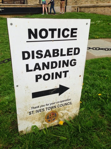
At a river quayside information for visiting boats...."NOTICE - DISABLED LANDING POINT".  There's a bold clear arrow which seems to directing you towards the disabled landing point.  Fair enough let's go that way.


Hang on, then we reach a sign and helpful arrow that sends us back in the same direction. 


What it really trying to convey is the this is the Disabled Landing Point.  Some vertical lines at the blunt/start end of the arrow would help.

The word 'point' does not really help either as it is in fact a landing an 'area' or zone.

And once you've landed, is it suitable to moor the boat one might wonder.  Is a "Landing Point" for boats the equivalent to the "Drop off" for cars at supermarkets and train stations....

And then  wonder some more....given that there's some disabled landing, there'll logically follow at some point the revere, some disabled boarding.....hopefully that's not somewhere else....

14.6.14

Head over heals

Counter intuitive road signs.  The one referring to the matters low down is up high and the one referring to high up is low down.  So the height restriction ahead warning is below the speed hump warning.   That's counter intuitive at best and simply illogical.

Maybe there's a prioritisation in the order, firstly the speed restriction to slow down to 15mph, then the speed bumps sign to reinforce that, and the height restriction would apply to fewer vehicles anyway.

Trying to communicate with someone driving a ton or two of steel, this seems like extra unnecessary effort to fathom, it just feels wrong.  The irony of this is of course that these safety measures are designed are to reduce risk.  Hopefully the signs this way do not detract sufficiently from that.


7.6.14

Just Take Care

In a narrow London Street there's some building work afoot involving scaffolding...."Take Care! Scaffolders at work" 

This is a splendidly simple and catch all cautionary sign.  It's says what's going on..."scaffolders at work" and gives some all encompassing advice "Take Care!".  Sure there's an encouraging explanation mark, but no need for shouting capitals.  Lower case being easier to read of course, as well as more polite.

It's not trying to pre-empt any specific risk, rather a general warning, encouraging some personal ownership and simple common sense.

31.5.14

Loo Queues

With no entrance to the gents loo to be seen from this main approach,  this set up could almost be mistaken for queues for relieving against the wall.  In reality it's empty bike racks.  

The gents sign correctly describes the building to which it is attached, so it's really just informational as opposed to directional.  All it needs is an arrow to direct you to the right and the entrance is of course just around the corner.

There's also some subtle re-enforcing of the idea with the Shower sight right next to the down pipe and it's kink to the guttering.

Nine Second Tap

A very full sign with some very precise instruction....'Press down on the top of the tap for water the water should stop running after 9 seconds.  If it does not then please report the fault to member of staff on site'.  The right hand tap is very hot for shaving.

So the hot tap, once pressed, should come on for nine seconds....but what if it's 8 or 10 seconds, even 7 or 11.  Is that really something that someone would feel obliged to report as a fault, even if there were able to time it that accurately.  Even if it's fifteen seconds.....

In fact 15 seconds is the NHS recommend minimum time for handwashing with soap and water anyway......http://www.wash-hands.com

Ideally a little more consistent punctuation would help.  There's one lonely full stop on the second line.   So it's either loose that or make the other lines consistent with stops or maybe a comma at the end of the first line.


17.5.14

Keep Clear Parking

Here some multiple parking instructions.  The top sign says that the area 'must be kept clear at all times.  But lower sign gives a different message, that the area can be used for up to five minutes for pick up and drop off.


Danger Not Deep Water

This sign adorns a rather pleasant little boating lake in the coastal resort of Southwold in Suffolk...."Danger .5m water depth".  So 0.5m is not that deep really, hence there's no claim to "deep water", just informing about the depth.  So it's really for the toddlers and youngsters really, given then drowning can occur in bathwater depths.  

It's the generic graphic which is at odds with the message here.  Here's someone nervously teetering on the edge looking over, but the implied dept there is at least person height and more like 2m, which is at four times the actual depth and potentially bottomless.

13.5.14

Keep this door closed

A great sign on a door.  "Keep this door closed".  Of course to fully comply then the door should never be opened.  Surely a door that should never be opened is actually a wall.  

Of course, it really means keep this door closed "when not in use".

In this case it's the door to the school kiln.  So some good reason, and hence the "safety notice" addition.


Correct Clocks

This sign is from a local authority car park.  "Blue Badge holders Max Stay 4 hours...clocks must be displayed correctly".   

For the blue badge parking system, parking is either unlimited stay or time limited stay. Where it's unlimited stay, just put the blue badge in the windscreen.  Where local parking restrictions impose a time limit on blue badge parking, there's a cardboard clock that needs to be used and is issued with the blue badge.  In those cases simply set the time on the cardboard clock for the time that you park, and that goes in the windscreen with the blue badge.

So in this situation, there's a time restriction and clocks need to be used.  Simple enough.  So it could say "4 hour parking limit, please use your clock". But the instruction here is more than to simply use the clocks.  There's a chastising undertone here, with the instruction to use the clock correctly..."clocks must be displayed correctly". Perhaps it could also to be explicit that everything else needs to be done correctly, display the blue badge correctly, and even "park correctly".  So correctly here simply means setting the clock to the arrival time.  Job done.

That chastising sense of using "correctly" creates it's own problems.  I fact the sign has been modified to hide some additional text.  So it originally read "In this section of the car park...." before "clocks must be displayed correctly".  That would imply that in the other section of the car park the clocks do not need to be displayed correctly.  That's probably why the text needed to be removed in the first place.  And that's all because of the apparent need to use the word "correctly", when correct use is natural, implied and easy. Otherwise it would have sufficed with "In the this section of the car park clocks must be displayed.

12.5.14

We want to make it better

Some signs on some internal hoardings, while some building work is going on in a motorway services station.  "We want to make it better".   On seeing the first sign, it has a chunk missing, which just might seem intentional design.  The the second one has a chunk missing too, this time in a different place.  It's not until you come across the third sign that you realise that they should be intact.  The irony is not lost that the signs about improvement works need some improvement themselves.


Seeing double yellow lines

Double yellow lines are such a familiar sight that we probably register them sub consciously.  That's why three yellow lines is do disconcerting and even disorienting..... Trippe lines gives double vision here.

"HDC" Parking

A sign at a local car park.  "This is H.D.C Pay and Display Car Park".  The H.D.C refers Huntingdonshire District Council in Cambridgeshire, being the local authority. This is a bit of local shorthand.  Fine if you'e a local resident, but if you're a visitor to this market town of a 1000 years, there's no reason you'd know what the HDC might stand for.  "Council" might be a better and more inclusive description.  Otherwise it might be tempting to consider what else the HDC might otherwise stand for...high daily charge, even hairy doored cars.

This Way to No entry

Here's a No Entry sign, from a charming and peaceful little marina on the Nrofolk Broads in Suffolk. It's just that we're more used to seeing the words "no entry" with a graphical no entry sign - the usual red circle with the white horizontal stripe.  And we're used to seeing arrows directing us to go a certain way.  So seeing an arrow that's directing us in a way we should not go is what throws us here. The fact it's red, in capitals and in a different font does strengthen the message.  But at the same time that does distract a bit much perhaps from what would appear to be the primary information and direction sign.

Total Repair - 15 times

A rare indulgent peak into the world of sales marketing.  Each sachet is highlighted with "Total Repair". If it is "total" repair then one cannot help but wonder why they would need to come in packs of 15.

Fix the Faulty Lock

At a London Drama School.  It's a sign on the outside of a loo door..."Faulty Lock.  Make sure it fully clicks. Sorry for the inconvenience".

It's been carefully done.  Polite lower case with a emphasising question mark, clear and efficient use of words, three different font sizes for emphasis.  Then it's been laminated too.  It does make you think that some of that effort might have been best placed in getting the lock fixed rather than slightly glamorising it's faultiness.

It's always slightly amusing to find the use of the word "inconvenience" in the context of a convenience of course.


Any Concerns?

One of those toilet notices demonstrating regular checking.  "These facilities are checked at regular intervals throughout the day. Please notify the Customer Service Desk if you have any concerns"

It's very tempting to take a trip to the Customer Service desk and share "any" concerns. Perhaps the state of the global economy, or the price of a loaf of bread.

These sorts of sings have tended towards referring to regular "checking", rather than regular "cleaning".  Just because there's a promise to check, is not the same as a commitment to clean.

10.5.14

Standby Standby

At a camp site, a 'standby toilet'.  Might be something to stand by, or even for standing at for relief, or even waiting for something else as in 'stand by, stand by'.  Practically of course it's the loo to use when the main ones are closed for cleaning.

Passing Cyclists

This is a sign for cyclists on the back of a low loader lorry..."Beware of passing vehicle on the inside". Depending where the emphasis is in the wording if this sign there can be different meaning. Its the reference to "this" vehicle which is missing...."Beware of passing this vehicle on the inside"

That technically leaves open a different interpretation.  There's a natural desire to fill in the missing words to make this a sentence.  The alternative to "passing this vehicle" is to add "a" to make it "a passing vehicle".

There's a general message here.  Firstly when signs become longer there's a real temptation for them to be read as sentences, and hence the emerging temptation to fill in any missing gaps, which might not necessarily be the right ones or in the right place.  Secondly

This sign also really matters, it's a potential life saver prompt.  Between 1986 and 2011, 439 cyclist were killed in traffic accidents in Grater London.  Over a two week period in November 2013 six cyclists died from from cycling accidents in Greater London.  That brought the total to for the year to 14, of which nine involved heavy goods vehicles.  That also needs to be set in the context of the number of London cycling journeys almost doubling over the preceding 10 years.  That appears to show a general trend over the longer term of reduced casualties per cyclist per kilometer per year. A potential life saver sign no less.

7.5.14

High on Weed

So here's the "High Street" road name sign.  

A weed has rather wonderfully grown just underneath the word 'High'. So with the drug related "weed" and "high" association, here we literally have "High on weed". Fantastic.


Please do not use the sign sign

Here's a sign which rather implies that the sign itself should not be used.  However it's appears to have been improvised to be in front of something else...so using the sign to encourage non-use of something else.

3.5.14

Designated Public Place

A fulsome and official sign. There's lots going on here....multiple colours, font sizes...headlines through to small print, plus some logos.

By default we'll be hooked by the headlines, the biggest and boldest.  So firstly, "YOU ARE IN A DESIGNATED PUBLIC PLACE"....and then the next headline is "MAXIMUM FINE OF £500".  
So on a quick first impression it looks like the message is about being liable to a fine, just by being there.  Serous red with some authoritative blue...that implicit reference to blue and red emergency colours .  And that's all in "shouting" capitals too.

In reality the context is about more specific circumstances - in the middle size print - namely around continuing to drink alcohol when asked not to do so by a police officer.

It's the juxtaposition of soft and general "public place", which by default is anything not private and where most of us find ourselves a lot of the time, with the formal and specific "designation" for around alcohol consumption.

There's also something about the adoption of the generic "designation" here.  Sure it's been designated, but the designation needs some more context specific headline description...It's probably more specifically alcohol management designation.


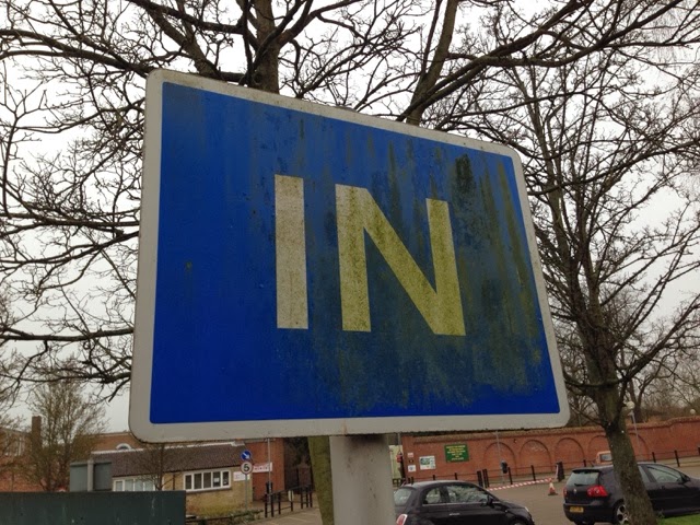
Welcome IN

The vehicle entrance to a local secondary school, and the "IN" sign.  As one of the first things seen on arriving at the premises, it makes an impression. While the word is "In" but given it's state it's also saying, dirty, scruffy, unloved.   That' all simple word association that subtly going on.  For some it could well be the first impression, for others a re-occurring and reinforcing impression.  It's not an overnight dirty either, it's taken a good time to get into this state.

And if it's the same entrance that staff use you'd think someone might have spotted it's state and triggered some action.  Equally, it's the sort of thing that builds up slowly, and hence can go unnoticed to those who pass it most.

It's another example of the power of signs to influence that first impression, before buildings or people are able to.  So it's not the modern buildings and smart teachers that make that first impression here.  It's also the tone that gets set....what else is dirty, scruffy and unloved.....

Not New High Visibility

So it's quite usual to plentiful signs at building sites and suchlike where the sensible of wearing safety clothing is a must....hard hats, safety shoes and high visibility clothing especially.  In this high vis sign, rather than use 'wear', it's 'worn'.  That can also also mean 'not new' of course, which can rather convey the message that the high vis clothing must not be "new" high vis clothing.

While we might be used to hearing the abbreviation of "visibility" to "vis", it's also usual in the written form to abbreviate the "High" to "Hi".  In the first abbreviation it's a shorter written and different sounding solution, without a strong different meaning.  Technically though Vis is a small Croatian island in the Adriatic sea, with a town of the same name and a population of around 3500, and it's the Vatican's press office - the Vatican Information Service.   At any rate "vis" does have some other very specific meanings, but not common place enough to matter here.

On the other hand, abbreviating "High" to "Hi", is different, perhaps one of the most common words of greeting in the western world.  The immediate distraction to think "hello" is mostly avoided here through the visual clue of the clothing and the association with "vis". In some cases the "High Visibility" is strangely abbreviated to "Hi Viability", and that starts to feel like a typo.


26.4.14

Seat Smoking

A retro fit window sticker in a vintage 1966 double decker bus.  Original notices of that era tended to be on plaques or printed directly on surfaces.  While the sticker is a more modern method it's still quit old as the vintage hint is still there, with the reference to "in the seats", a particular turn of phrase.  

There's some tempting literal interpretation possible here too.  "Seats" here is about the seating area, so no smoking in the seating area please.  Rather that to mean the inside the fabric or construction of any of the individual seats which is then described in the plural....those seats would not have been of modern fire retardant standard......

Looks like there's been some attempts to remove it, a possible recent recognition of it's rather surplus status with a modern accepted default of no smoking in inside public spaces.

Go to the bar

There's a rather fantastic collection of home made slot machines to be found on the pier at Southwold in Suffolk.


Given their uniqueness and their acknowledged temperamental nature, there's a sign to use the intercom for assistance.  That's supplemented by a delightful postscript..."If no reply go to the bar".

That could of course mean that at the bar you shall find pier staff to assist you.  Equally it's somewhere just to go for a drink to cope with the any disappointment or frustration.  Or even if there's no-one on the intercom, it's because they've themselves gone to the bar. I suspect that the interpretive licence is intended here. Love it.


Red Tick

There's some thing a little perplexing about this sign from a hospital toilet area.  It's one of those issues hidden in plain sight.  It's because the tick and it's colour are at odds with each other.  We're more used to seeing green ticks and red crosses, so the red tick is what throws us, but without at first realising why.  Sometimes that juxtaposition can be an intentional thing to encourage or force that thinking and to hold the attention that bit longer to make a connection.

19.4.14

Caring Tree

A quirky handmade sign discouraging littering...."Think before you throw your litter down, you may not care but I do".  

Technically just encouraging the 'thinking' about it though, before explicitly describing the action that it is in fact discouraging (arguably 'shouting' in capitals') 'throw' your litter down'.  That "throw" is a strong and active description, even angry, rather then a description of perhaps typically more nonchalant dis-guarding of litter.

The alternative is to encourage the desirable action.   With the 'You may not care but I do - Please use a litter bin'.  Or to reflect the request to think..."Please consider using a litter bin."  

The original prose curiously opens up the question about whether the message had been left on behalf of the tree so giving it a voice, or possibly that the author is looking on. 


12.4.14

On Parking

A charming home made "No Parking Private" sign.  It shows come real care in the painted letters....perhaps based on a stencil and then care in some sharp lines.  It's the bigger picture where the overall effect is not so sharp.... That stencil seems to have been the wrong way around for the N in No, and hence creation of a new letter form, the mirror image of a capital N.  The spacing then stands out too...Private is keenly biased to the left.  There's a also a little hint on the slightly slanting G of parking, titled just enough to squeeze it into the remaining white space before the border.