28.6.14

Way Out Wonder

One of the traditional London Undergourd way out signs.  So much more than information giving, extra richness...design, colour, and three dimensional of course...almost art.

21.6.14

Well not exactly here

This is the green waste recycling point at the local allotment. The sign says 'Please only deposit green waste here. No Bricks Soil Carpet Wood Glass or Polythene".

The intended emphasis is on the green waste - rather than other debris.  But to literally place green waste 'here' would inevitably obscure the sign. So considerate depositors have not placed the green waste 'here', but intuitively and  rather around the outside of the sign.


This Way That Way

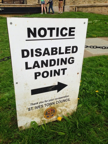
At a river quayside information for visiting boats...."NOTICE - DISABLED LANDING POINT".  There's a bold clear arrow which seems to directing you towards the disabled landing point.  Fair enough let's go that way.


Hang on, then we reach a sign and helpful arrow that sends us back in the same direction. 


What it really trying to convey is the this is the Disabled Landing Point.  Some vertical lines at the blunt/start end of the arrow would help.

The word 'point' does not really help either as it is in fact a landing an 'area' or zone.

And once you've landed, is it suitable to moor the boat one might wonder.  Is a "Landing Point" for boats the equivalent to the "Drop off" for cars at supermarkets and train stations....

And then  wonder some more....given that there's some disabled landing, there'll logically follow at some point the revere, some disabled boarding.....hopefully that's not somewhere else....

14.6.14

Head over heals

Counter intuitive road signs.  The one referring to the matters low down is up high and the one referring to high up is low down.  So the height restriction ahead warning is below the speed hump warning.   That's counter intuitive at best and simply illogical.

Maybe there's a prioritisation in the order, firstly the speed restriction to slow down to 15mph, then the speed bumps sign to reinforce that, and the height restriction would apply to fewer vehicles anyway.

Trying to communicate with someone driving a ton or two of steel, this seems like extra unnecessary effort to fathom, it just feels wrong.  The irony of this is of course that these safety measures are designed are to reduce risk.  Hopefully the signs this way do not detract sufficiently from that.


7.6.14

Just Take Care

In a narrow London Street there's some building work afoot involving scaffolding...."Take Care! Scaffolders at work" 

This is a splendidly simple and catch all cautionary sign.  It's says what's going on..."scaffolders at work" and gives some all encompassing advice "Take Care!".  Sure there's an encouraging explanation mark, but no need for shouting capitals.  Lower case being easier to read of course, as well as more polite.

It's not trying to pre-empt any specific risk, rather a general warning, encouraging some personal ownership and simple common sense.