6.12.14

Car Park Make Over

Here's a major regional shopping centre with a range of large and multi-story car parks.  Both the name and visual identification of the car parks is by its colour.  This is the Perkins Yellow Car par.  So here "yellow" has two roles - it's both a label (a single unique word) and a style at the same time.   Of course that label could be any unique word (monkey, spaceship, brick, smartie etc) or a number. 

The trick here is that the "label" yellow is also providing a visual clue in the word yellow, as we have a mental natural association with different colours.  So colour lables can be easier to remember because they are emotionally connected.  So it's not just a mental note but a sub concious emotional note too.  (Red tends to be physical, blue is intellectual, green is balance and yellow is emotional).

But it's now having a "makeover", and that usually implies some significant visual change, including some significant colour changing.   So if the colour changes, does the name need to change too?  Technically the "yellow" label could still apply even if the "yellow" styling changed.  Realistically, the originally helpful use of the single word for double meaning as both a label and a style would need to evolve to remain consistent.


29.11.14

Take Care on the Flat Stairs

The message here is helpful enough "Caution - Take care on the stairs".  But the words and the visuals do not align which can create some jarring.  So the picture is of flat ground, so more like slipping.  The picture would much suite a suit a message about being cautions on wet or slippery floors.

Double First Aid

At  a local garden centre restaurant...when one sign might  not be enough, use an exact duplicate alongside to re-enforce the point.

But lots of other revealing interest here too....

Firstly it's a message targeted at staff but it's a big message on prominent public display, and of course duplicated too. The design effort in creating an atmosphere and ambience for diners, can be somewhat diminished by this.

Secondly, there a curious tautology going on here.  It's a staff notice, telling staff that it's not for staff use.  So is it must be for public use.  But the notice's target audience is staff  - given the clear 'Staff Notice ' header. So if you're a member of the public, despite the prominent public and duplicate display  it's not for you.

Thirdly, the definition of "use" in this case can be seen three quite distinct ways ways.  Either it's use of the first aid items by the staff for their own injuries.  Or it's the use of the use of those items by the staff for customer injuries.  Or it's the use by customers for their own injuries.  In practice it's the middle one of course - that's the whole point of having a first aiders.  The sign's really about discouraging the use by staff for their own injuries.  There'll be a separate staff first aid box with different things in - for example different colour plasters for use by staff to ensure their injury is prominently treated. 

The reality here is that the sign's a substitute for something missing around staff policy, training or awareness. There's a fair chance that perhaps one member of staff once used something from this first aid kit for their own care.  But the corporate reaction rather than being targeted and specific id generic - duplicate signs targeted at all staff on display to all customers.   

22.11.14

Follow the Footprints

Here's the sign for a local after school club.  

To find find the club, simply follow the footprints.  That might be more tricky than it seems. 

Firstly the footprints are not in the floor but on the wall.  Secondly they go in all directions, left, up, right.

In fact the footprints that are being refereed to are ones that were painted on the ground, but have since been worn away.  A subtle arrow might just help, without detracting from the jolly footprint theme.


8.11.14

Nice No Entry

Sometimes less is definitely more.

Here's a lovely example.  A sufficiently obvious, clear and simple sign.

No need here for barriers, cones or ropes, just a clear official message.  It also sends a message of trust - there's no physical barrier, in fact it's not even in the middle of the path.  And being bestowed with trust just might make it more difficult to betray that trust by contravening the message.


Door and Tap Instuctions

Even some of the most everyday activities get the sign treatment.   Here's a great example of how to lock a door and then operate a tap.

To be fair, it's a farmhouse that's very kindly hosting a ticketed charity event.  So the what would ordinarily be a private loo becomes a public loo.

So instruction for locking the loo door does play to that need for confidence that the loo can be secure and private.

"TO LOCK THE DOOR
Please push handle upwards
then turn the knob to the right

To UNLOCK
Turn door knob to left"

There's a rapid transition here from polite and full in the first half (please...turn the knob to the right) to a much more direct and abbreviated second half (turn door knob to left)

And then for the tap instruction.  Taps are increasingly blending from with function.  Sometimes the form can make the function a bit difficult to fathom at times.  For example the increasingly common stick mixer tap - where you need to control not only the balance between hot and cold bit also the flow.   So which way do you move the single lever.....forwards and backwards and left and right.  Anyway, this has been properly anticipated here with the message
"TO OPERATE TAP
PULL LEVER TO THE RIGHT"


18.10.14

Reserved for Bicycles

Cycle "parking" can be described in may different ways.  Often the simple presence of some racks can be enough.  Here's a rather charming version for a rack and roof structure.... Rather like a restaurant reservation, this area is "reserved", and not for cycles, but the more formal "bicycles".

11.10.14

Press What Red Bell Button?

Here'a an intercom system.  So it's the front door first impression.

So what to do.....There's a camera for starters, so someone might be watching.

But what button to press.  Maybe you get spotted on camera and get a welcoming voice over the intercom.  But more realistically it's working out what button to press.  You're naturally drawn to the biggest button, right above the speaker that also happens to have a green marker.   But then there's some instruction, although quite low down...."Please press the red bell button".  Well there's no bell button, but there is a button with a red circle on...is that the one they mean?  Red is not the most positive and encouraging colour for these circumstances either, typically used for emergency buttons like fire alarms.  The the red dot is probably the closest match to the instruction.... let's go for that.

In reality, the red sticker seems to have been added over the bell picture as with all the pressing the colour had warn away.  But you're left with a test to enter.

What's extra curious about this is that it is the entrance to an organisation that provides arbitration services and hires out rather nice business meeting rooms.    So as a hiring customer it's creating an impression already with a test/challenge/barrier, do they really understand my needs.  And what about those arriving for arbitration, creating initial barriers or angst at the moment of arrival is probably not the best start to proceedings.


4.10.14

Exit Exit Exit Exit

Here's a new car park.  The exit can be approached from three main directions, all of which converge at this single corner point.  That means the signs have to work from three different directions which creates a rather intense and slightly disconcerting arrangement as you you travel through. 

20.9.14

Any Assistance?

It can be tricky to get the signs right in loos.  Here's the double bonus from a national coffee shop chain.

1. So "Please pull cord for assistance".  But what sort of assistance is reasonable.... where to draw the line.... That sign is intended to be associated with the emergency pull cord of course, but is off the side.

2.  And "Please only put toilet tissues down the toilet".  That's to discourage things like nappies which cause blockages.  But the word "only" clearly restricts anything other than tissue.  Surely the purpose of the visit to the small room is to provide some surplus body output for the pan......so what to do with that if the only thing that can go down the loo is toilet tissues?

Reserved Coucil

Each organisation will have it's own approach to risk, some even formalise and articulate their "risk appetite".  That includes our public sector statutory authorities, which given the public money being spent, can encourage some natural risk aversion.

So when we see "Town Council Reserved" it might well be interpreted as a statement of risk appetite.  It is really intended to refer to the parking alongside of course.   It's really just a wide flagstone pavement and there's no parking bay marked, so with no other parking hints, it does rather teasingly encourage that wider sense of "reservation".


9.8.14

Need to Notice


As if 'No Smoking' is not clear and well established, this notice one has an extra and rather polite plea to adhere to that no smoking message.

2.8.14

Cleanliness

Here's a sign which is positivity encouraging cleanliness.  However the sign itself is itself rather dirty.  So it's not setting a standard, default or visual expectation.  It's an authority statement which attracts interest and attention but the visual clues are at odds with the message.

26.7.14

Respectful Recycling

Some simple please and thank yous can really help set positive, polite and engaging tone.  Here for some recycling bins.  A less formal font for the please and thanks yous too.


20.7.14

Solo Motorcycles Only

Some dedicated London parking for 'solo motorcycles only'.

Given that the alternative to a solo motorcycle is a motorcycle with a sidecar,  and motorcycles with sidecars are so rare, then the word solo is rather overprescriptive, even superfluous.  

Also, most solo motorcycles can carry a pillion passenger.  Technically that would make them no longer solo.  So motorcyclist and passenger, just as with a sidecar.


19.7.14

Properly Private Property

Some lovely old and substantive 'Private Property' signs adorning the edge if a public footpath across a meadow.  Super three dimensional signs cast in metal, and have stood the test of time.


13.7.14

Please Sweep up

At the local recycling centre... "Please sweep up. Thank you'.

So please and thank you, so as many polite words as instruction words.

What is nice about this is that the implication is that you sweep up your own mess. But if course this could be read as a direct instruction to sweep up mess, irrespective of whether it's your own or not.  Even if you don't have any rubbish...coming across this sign seems to ask you to muck in.

12.7.14

Cupboard Door Exit

A fantastic large old house converted to a tea room.  With some alterations to provide all the necessary facilities of course.

From inside the toilet the thing that looks like the exit door - delightful and substantive four panel - is not exit/entrance door but in fact the cupboard.  There's a wonderful sign near the handle saying as much....'This us a cupboard not the way out'.  The actual exit is a more plain affair, flat with a run handle and grab rail.   So the visual clues are less.... with the cupboard there are fur panels and and handle to naturally draw you.

To help, as well as the negative "don't use this door message", how about a positive "This is the exit sign" on the real exit door.


6.7.14

Door Challenge

A sturdy oak door to the farm shop tea room.

So there's a clear polite sign... 'Please close the door behind you'.  Tis lrft at's reasonable enough as it's winter and its chilly.  However, as it's winter the door has swollen and is very difficult to pull properly closed.

That sign now takes on a very different messsge.  The owner/staff will know the door is stiff but still the sign is there.  So now the sign means that you're being expected to win the battle with the very stiff door.  Be prepared to use all your might and make some noise. 

Now that reasonable, clear and polite sign now seems like a much less reasonable customer test.  In reality, the door Is left jammed against it's frame but not fully closed.

Right, off to the farm shop now, curious about what other unreasonable customer requests are yet to come.


5.7.14

Sorry Warden

Not in use sign on a loo door at a camp site...."Not in use until further notice Sorry for any inconvenience Warden"

So the first couple of lines seem like a whole sentence.  "Not in use until further notice" with the slightly bigger "Not in Use" to emphasise the point up front.  

Then what you might think was a second sentence...'Sorry for the inconvenience warden'. So an apology to the ward.   It's really a second sentence with an authorship statement underneath...which makes it an apology from the warden.   The second sentence idea sense is reinforced by the fact it's longer and hence scrolled onto the next line. 

In this case it white space which is missing, a blank line before warden, so that is sufficiently separate and then will feel like an author/signature line.


28.6.14

Way Out Wonder

One of the traditional London Undergourd way out signs.  So much more than information giving, extra richness...design, colour, and three dimensional of course...almost art.

21.6.14

Well not exactly here

This is the green waste recycling point at the local allotment. The sign says 'Please only deposit green waste here. No Bricks Soil Carpet Wood Glass or Polythene".

The intended emphasis is on the green waste - rather than other debris.  But to literally place green waste 'here' would inevitably obscure the sign. So considerate depositors have not placed the green waste 'here', but intuitively and  rather around the outside of the sign.


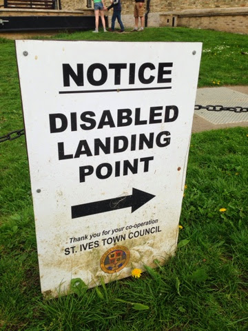
This Way That Way

At a river quayside information for visiting boats...."NOTICE - DISABLED LANDING POINT".  There's a bold clear arrow which seems to directing you towards the disabled landing point.  Fair enough let's go that way.


Hang on, then we reach a sign and helpful arrow that sends us back in the same direction. 


What it really trying to convey is the this is the Disabled Landing Point.  Some vertical lines at the blunt/start end of the arrow would help.

The word 'point' does not really help either as it is in fact a landing an 'area' or zone.

And once you've landed, is it suitable to moor the boat one might wonder.  Is a "Landing Point" for boats the equivalent to the "Drop off" for cars at supermarkets and train stations....

And then  wonder some more....given that there's some disabled landing, there'll logically follow at some point the revere, some disabled boarding.....hopefully that's not somewhere else....

14.6.14

Head over heals

Counter intuitive road signs.  The one referring to the matters low down is up high and the one referring to high up is low down.  So the height restriction ahead warning is below the speed hump warning.   That's counter intuitive at best and simply illogical.

Maybe there's a prioritisation in the order, firstly the speed restriction to slow down to 15mph, then the speed bumps sign to reinforce that, and the height restriction would apply to fewer vehicles anyway.

Trying to communicate with someone driving a ton or two of steel, this seems like extra unnecessary effort to fathom, it just feels wrong.  The irony of this is of course that these safety measures are designed are to reduce risk.  Hopefully the signs this way do not detract sufficiently from that.


7.6.14

Just Take Care

In a narrow London Street there's some building work afoot involving scaffolding...."Take Care! Scaffolders at work" 

This is a splendidly simple and catch all cautionary sign.  It's says what's going on..."scaffolders at work" and gives some all encompassing advice "Take Care!".  Sure there's an encouraging explanation mark, but no need for shouting capitals.  Lower case being easier to read of course, as well as more polite.

It's not trying to pre-empt any specific risk, rather a general warning, encouraging some personal ownership and simple common sense.

31.5.14

Loo Queues

With no entrance to the gents loo to be seen from this main approach,  this set up could almost be mistaken for queues for relieving against the wall.  In reality it's empty bike racks.  

The gents sign correctly describes the building to which it is attached, so it's really just informational as opposed to directional.  All it needs is an arrow to direct you to the right and the entrance is of course just around the corner.

There's also some subtle re-enforcing of the idea with the Shower sight right next to the down pipe and it's kink to the guttering.

Nine Second Tap

A very full sign with some very precise instruction....'Press down on the top of the tap for water the water should stop running after 9 seconds.  If it does not then please report the fault to member of staff on site'.  The right hand tap is very hot for shaving.

So the hot tap, once pressed, should come on for nine seconds....but what if it's 8 or 10 seconds, even 7 or 11.  Is that really something that someone would feel obliged to report as a fault, even if there were able to time it that accurately.  Even if it's fifteen seconds.....

In fact 15 seconds is the NHS recommend minimum time for handwashing with soap and water anyway......http://www.wash-hands.com

Ideally a little more consistent punctuation would help.  There's one lonely full stop on the second line.   So it's either loose that or make the other lines consistent with stops or maybe a comma at the end of the first line.


17.5.14

Keep Clear Parking

Here some multiple parking instructions.  The top sign says that the area 'must be kept clear at all times.  But lower sign gives a different message, that the area can be used for up to five minutes for pick up and drop off.


Danger Not Deep Water

This sign adorns a rather pleasant little boating lake in the coastal resort of Southwold in Suffolk...."Danger .5m water depth".  So 0.5m is not that deep really, hence there's no claim to "deep water", just informing about the depth.  So it's really for the toddlers and youngsters really, given then drowning can occur in bathwater depths.  

It's the generic graphic which is at odds with the message here.  Here's someone nervously teetering on the edge looking over, but the implied dept there is at least person height and more like 2m, which is at four times the actual depth and potentially bottomless.

13.5.14

Keep this door closed

A great sign on a door.  "Keep this door closed".  Of course to fully comply then the door should never be opened.  Surely a door that should never be opened is actually a wall.  

Of course, it really means keep this door closed "when not in use".

In this case it's the door to the school kiln.  So some good reason, and hence the "safety notice" addition.


Correct Clocks

This sign is from a local authority car park.  "Blue Badge holders Max Stay 4 hours...clocks must be displayed correctly".   

For the blue badge parking system, parking is either unlimited stay or time limited stay. Where it's unlimited stay, just put the blue badge in the windscreen.  Where local parking restrictions impose a time limit on blue badge parking, there's a cardboard clock that needs to be used and is issued with the blue badge.  In those cases simply set the time on the cardboard clock for the time that you park, and that goes in the windscreen with the blue badge.

So in this situation, there's a time restriction and clocks need to be used.  Simple enough.  So it could say "4 hour parking limit, please use your clock". But the instruction here is more than to simply use the clocks.  There's a chastising undertone here, with the instruction to use the clock correctly..."clocks must be displayed correctly". Perhaps it could also to be explicit that everything else needs to be done correctly, display the blue badge correctly, and even "park correctly".  So correctly here simply means setting the clock to the arrival time.  Job done.

That chastising sense of using "correctly" creates it's own problems.  I fact the sign has been modified to hide some additional text.  So it originally read "In this section of the car park...." before "clocks must be displayed correctly".  That would imply that in the other section of the car park the clocks do not need to be displayed correctly.  That's probably why the text needed to be removed in the first place.  And that's all because of the apparent need to use the word "correctly", when correct use is natural, implied and easy. Otherwise it would have sufficed with "In the this section of the car park clocks must be displayed.

12.5.14

We want to make it better

Some signs on some internal hoardings, while some building work is going on in a motorway services station.  "We want to make it better".   On seeing the first sign, it has a chunk missing, which just might seem intentional design.  The the second one has a chunk missing too, this time in a different place.  It's not until you come across the third sign that you realise that they should be intact.  The irony is not lost that the signs about improvement works need some improvement themselves.


Seeing double yellow lines

Double yellow lines are such a familiar sight that we probably register them sub consciously.  That's why three yellow lines is do disconcerting and even disorienting..... Trippe lines gives double vision here.

"HDC" Parking

A sign at a local car park.  "This is H.D.C Pay and Display Car Park".  The H.D.C refers Huntingdonshire District Council in Cambridgeshire, being the local authority. This is a bit of local shorthand.  Fine if you'e a local resident, but if you're a visitor to this market town of a 1000 years, there's no reason you'd know what the HDC might stand for.  "Council" might be a better and more inclusive description.  Otherwise it might be tempting to consider what else the HDC might otherwise stand for...high daily charge, even hairy doored cars.

This Way to No entry

Here's a No Entry sign, from a charming and peaceful little marina on the Nrofolk Broads in Suffolk. It's just that we're more used to seeing the words "no entry" with a graphical no entry sign - the usual red circle with the white horizontal stripe.  And we're used to seeing arrows directing us to go a certain way.  So seeing an arrow that's directing us in a way we should not go is what throws us here. The fact it's red, in capitals and in a different font does strengthen the message.  But at the same time that does distract a bit much perhaps from what would appear to be the primary information and direction sign.

Total Repair - 15 times

A rare indulgent peak into the world of sales marketing.  Each sachet is highlighted with "Total Repair". If it is "total" repair then one cannot help but wonder why they would need to come in packs of 15.